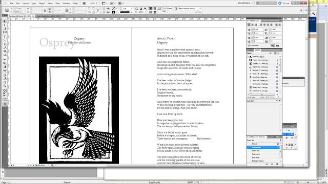
Curiously, it’s been a lot more work to integrate the pictures this time round. In the first volume, nearly all the artwork came either as a framed rectangle (see the osprey above) or with the bird alone in a stark white space so that it could be easily dropped onto the page.
Quite a few of the artists for BB2, however, have submitted work on tinted or textured paper, or with some elements surrounding the bird that are abruptly cut off at an edge. I hadn’t counted on this, and it’s been tricky trying to work out how best to place them on the page. This red-necked phalarope by Anna Le Moine Gray is painted in soft watercolours on a slightly bubbly paper that fades to grey towards the bottom (a side effect of the scanning process, I think).
Cutting off everything but the bird and signature left it looking like it had been scissored out and stuck to our page, when we really wanted it to look as if it’s part of the page. So in the end I deleted large swathes of the texture around the edges but left some of it around the bird, fading out:
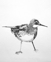
Le Moine Gray’s common sandpiper was a tougher challenge – the paper was much greyer, so that where the feet end is very suggestive and hard to pin-point when cutting around it.
At first I tried blending the feet in with a pencil version of the same piece the artist had sent us, so that the feet had a starker outline. No matter how hard I squinted, it looked messy. Upping the contrast ruined all the precise and subtle shading on the bird itself, and fading out to white made it look like the sort of misty portrait you might find on a collector’s plate. So I ended up deploying a similar method to the above piece, but having the texture fade out to grey instead of white. Then I placed it inside a larger grey rectangle in InDesign that filled up most of the page:
Still need to do a little work on it, but getting there!


